Video overview
Overview
This document provides a module-by-module breakdown of the App Home Screen & Sport Home Screen, when using Version 182.0.0+.
These modules can be found in your Content Management System (CMS) in the Mobile App Settings > Home Screen Configuration page.
Click below to jump directly to the section listed:
- Mobile App Home Screen & Sport Home Screen
- Module Configuration in CMS
- Content Modules
- Module Order
- Game Rotator
- Clips Circle Slider Playlist
- Stories List
- Video Slider
- Gallery Slider
- Promo Slider
- Hero Promo
- Shop
Module Configuration in CMS
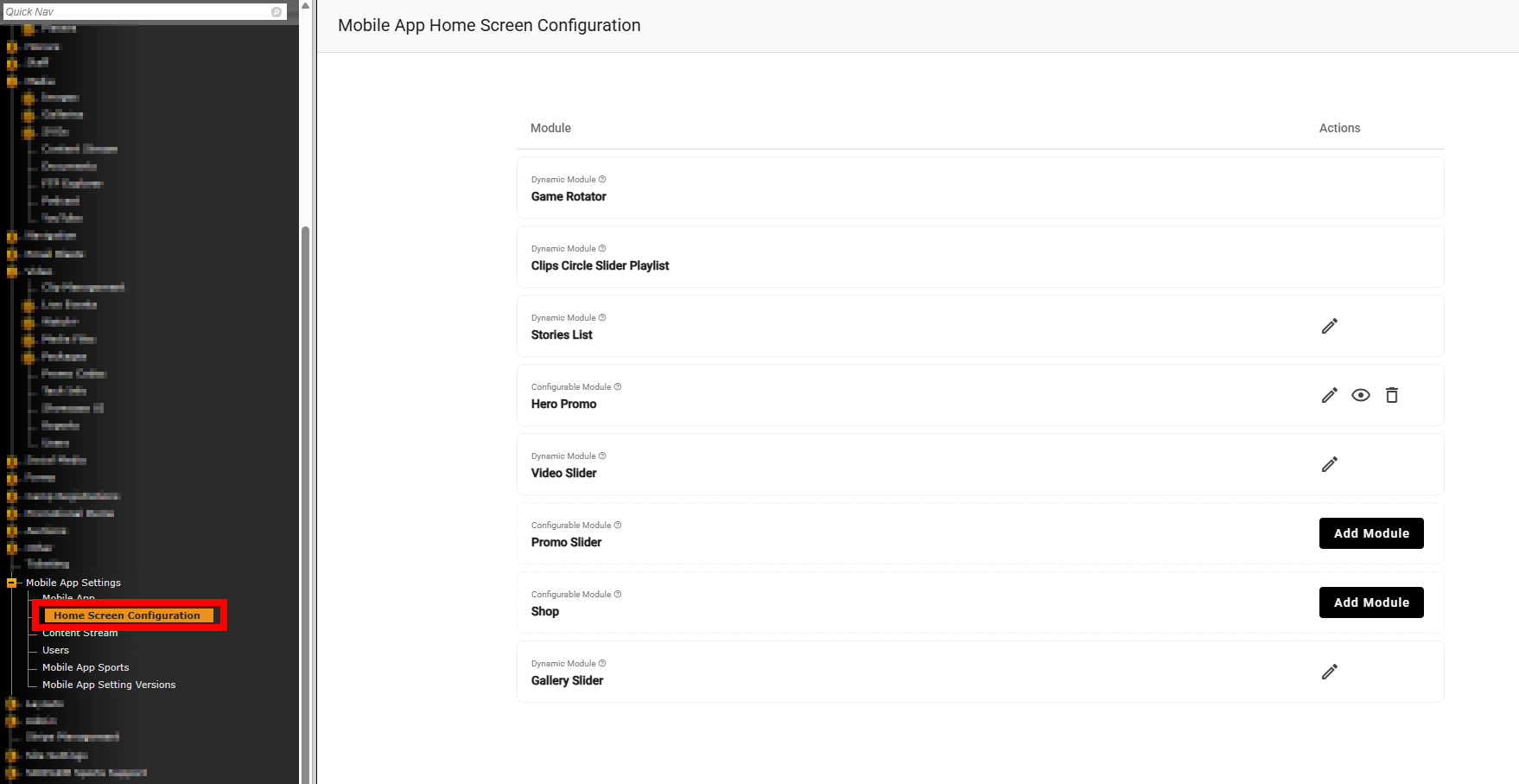
The modules on the App’s Home Screen and Sport Home Screens can be managed in the CMS.
To access this page, an admin will need to log in to the CMS and navigate to Mobile App Settings > Home Screen Configuration.
Content Modules
The content modules available for the App are:
- Game Rotator (Tile)
- Clips Circle Slider Playlist
- Stories List
- Hero Promo
- Video Slider
- Promo Slider
- Shop
- Gallery Slider
Home Screen and Sport Home Screen
The modules on the home screen will display content for all sports.
The modules on the sport home screens will display content for that sport only.
At this time, the sport home screens will include the following content modules only:
- Clips Circle Slider Playlist
- Stories List
- Video Slider
- Gallery Slider
Dynamic and Configurable Modules
Content modules will fall into one of two categories:
- Dynamic
- Configurable
A dynamic content module is populated with the latest content available within the CMS and requires no additional admin management.
The dynamic content modules are:
- Game Rotator (Tile)
- Clips Circle Slider Playlist
- Stories List
- Video Slider
- Gallery Slider
A configurable content module is customizable and requires the content to be manually populated.
The configurable content modules are:
- Hero Promo
- Promo Slider
- Shop
Module Order
The module order is not customizable at this time. Modules with no content will not display on the Home Screen or Sport Home Screens. Configurable modules can be hidden or deleted in the CMS.
The order of the modules on the Home Screen:
- Game Rotator
- Clips Circle Slider Playlist
- Stories List
- Hero Promo
- Video Slider
- Promo Slider
- Shop
- Gallery Slider
The order of the modules on the Sport Home Screen:
- Clips Circle Slider Playlist
- Stories List
- Video Slider
- Gallery Slider
Game Rotator
What It Is
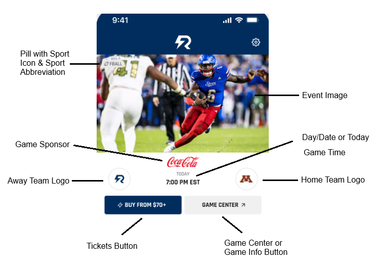
This module is also referred to as the Game Tile and appears on the Home Screen only. It is expected to dynamically display the most important information about a school’s upcoming games or events. The events and their corresponding content must be populated on a Sport Schedule in the CMS to display in the Rotator (Schedule > Game > Game Information, Opponent/Location, and Media Coverage Tabs ).
Content
Content expected to appear for each game in the Game Rotator (if populated in CMS):
ALL GAME STATES
- Pill with Sport Icon + Sport Abbreviation
- Event Image
- Game Sponsor
- Client Logo
- Opponent Logo
- Game Center or Game Info button
PREGAME
- Day/date or “Today” text displayed
- If a Game Center sport, countdown clock appears 24 hours prior to game time
- Time
- Tickets Button
LIVE
- Applicable to Game Center Sports Only
- In-progress scores for each team
- Time remaining in game and the quarter/half
- If at the end of a quarter or half, “End of 1st Quarter” or “Halftime”
POSTGAME
- Final scores for each team
- “Final” text displayed
How It Works
Display Timing
Game Center Sports
If the sport has Game Center functionality and Game Center is enabled, the event will begin displaying in the Rotator 48 hours prior to the date and time of the game. It will no longer display in the Rotator as of 3 a.m., following the completion of the game.
Sports without Game Center
If the sport does not have Game Center functionality, or the app is not using our Game Center product, the event is expected to start displaying in the Rotator at 12 a.m. on the day of the game and no longer display after 11:59 p.m.
Display Priority
Game Center Sports
If the sport has Game Center functionality, and Game Center is enabled, Game Center sports are expected to display as the first events in the Rotator.
Sports without Game Center
Sports without Game Center will display in the priority order set for Gameday Sports in the CMS (Mobile App Settings > Mobile App Sports > Gameday Sports > Gameday Drag & Drop).
If no order is set in the CMS, the events in the Rotator are organized chronologically by default based on start time.
Event Image + Video
There are multiple ways that an image and/or video can be populated in the Game Rotator. The recommended best practice is to upload an image specifically for the Game Rotator in the CMS by navigating to Schedule > Game > Event Image.
TIPS:
Upload high-quality images at 1920x1080px for the best results.
To ensure the Pre-Game or Post-Game Story Image will populate as a backup when there is no Event Image, associate your pre-game or post-game story to that game on the Associations & Rankings tab when creating your story.
Image
The app checks the following CMS locations in order to determine the Rotator image/video shown (broken down by game state):
- PREGAME
- Event Image (from Schedule > Game > Event Image)
- Media Image (from All Access if an All Access event is associated to the game and has a poster image)
- Pre-Game Story Image (from Story > Primary Image)
- Generic default image with the client’s logo if none of the above are present
- LIVE
- Applicable to Game Center Sports Only
- Event Image (from Schedule > Game > Event Image)
- Media Image (from All Access if an All Access event is associated to the game and has a poster image)
- Pre-Game Story Image (from Story > Primary Image)
- Generic default image with the client’s logo if none of the above are present
- POSTGAME
- Post-Game Story Primary Image (from Story > Primary Image)
- If there is a video associated in the Post-Game Story, a “Play” button will show on top of the Primary Image.
- Event Image (from Schedule > Game > Event Image)
- Media Image (from All Access if an All Access event is associated to the game and has a Poster Image)
- Pre-Game Story Image (from Story > Primary Image)
- Generic default image with the client’s logo if none of the above are present.
- Post-Game Story Primary Image (from Story > Primary Image)
Video (Game Center Sports Only)
Video can be incorporated into the Game Rotator for Game Center sports. A "Play" button icon will appear on top of the Poster Image thumbnail to indicate a video is available.
- Poster Image & Video from Live Event (from Video > Live Event > Associated to Game Center Sport > Associated to Game Center Game > Show in Game Center Tile > Yes > Check Pre-Game, Live, or Post-Game Box > Save)
- Poster Image & Video from Media File (Game Center Sports Only) (from Video > Media File > Associated to Game Center Sport > Associated to Game Center Game > Show in Game Center Tile > Yes > Check Pre-Game, Live, or Post-Game Box > Save)
School Logos
The logo of the client and the opposing team are expected to display in the Game Rotator.
The away team logo is expected to display on the left. The home team logo is expected to display on the right.
The opposing team’s logo and the home or away designation is managed in the CMS (Schedule > Game > Opponent/Location Tab).
Game Sponsor
The sponsor logo that displays within the Game Rotator is the same sponsor logo that is displayed on the schedule page. This sponsor image is populated in the CMS (Schedule > Game > Promo Image).
Areas where the Game Sponsor (Promo Image) displays:
- OAS and Mobile App schedules
- OAS and Mobile App Game Center header
- OAS and Mobile App Next Game component
- OAS and Mobile App Featured Game component
- Mobile App Game Rotator (Tile)
- Mobile App Game Details screen (non-Game Center sports)
Tickets Button
A tickets button will display within the Game Rotator if a ticket link is populated in the CMS or when using the Paciolan ticketing integration.
Paciolan
For Paciolan clients with the OAS integration enabled, and inventory available to sell, a button will display on the tile in the Game Rotator, with the get-in pricing (Buy From $70+).
Tapping the button opens the event details page natively in the Pac SDK (if the SDK is present). If the SDK is not present, a BUY TICKETS button will still populate, however the URL will open in an external WebView.
CMS
For non-Paciolan clients, a BUY TICKETS button populates on the tile in the Game Rotator when a URL is present in the CMS (Schedule > Edit Game > Media Coverage tab > Tickets Link).
When tapped, the button opens the input client URL in an external WebView.
Game Center or Game Info Button
For Game Center sports, a GAME CENTER button will populate on the tile in the Game Rotator, and when tapped, opens the Game Center for that specific game.
For non-Game Center sports, a GAME INFO button will populate on the tile in the Game Rotator, and when tapped, opens the Game Details screen for that specific game.
Clips Circle Slider Playlist
What It Is
A Clip is a vertically formatted 9:16 ratio video. Clips are grouped into Playlists. The playlists are managed in the CMS (Video > Clip Management). The CMS is used to curate playlists of vertical content whether it be for a sport, a player, or a category such as hype reels.
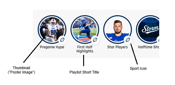
The Clips Circle Slider Playlist displays playlists with recent content uploaded to them. Each circle represents an individual playlist.
If Clip Management is not active in your CMS, you can reach out to support@sidearmsports.com for more information.
More info on Clips can be found here
How It Works
On the Home Screen, recent playlists from all sports will show in the circle slider component.
On Sport Home Screens, recent playlists from the respective sport will show in the circle slider component.
Display Parameters
The circle slider will show all playlists with videos that have been added to that playlist within the last 10 days.
- The number of circles (playlists) that display will depend on the number that meets the criteria above. For example, if there is only one playlist with a video from the last 10 days, only one circle will show
- If no playlists have videos from the last 10 days, the component will not show
- The circle will contain thumbnail (“poster image”) from the most recent clip added to the playlist
Playlist Title and Sport Icon
A playlist short title displays below the circle to inform the user what content is in the playlist.
- The short playlist title is managed in the CMS:
- Video > Clip Management > Add Playlist or Edit Playlist > Step 1 - Details > Short Title
- The short playlist title is required moving forward.
- If an admin creates a new playlist, the short playlist title field will be required to proceed to the next step
- If an admin edits an existing playlist that was created prior to the field existing, the admin will be required to add a short title to proceed to the next step
- The short playlist title is limited to 22 characters for style and accessibility purposes
- If the full 22 characters are used, it is expected that the characters will split into 2 lines
- Admins will not be able to proceed to the next step if more than 22 characters are used. A red error message will display to inform the admin that they went over the 22 character limit.
An icon displays in the bottom right of the circle to easily distinguish for the user which sport the playlist is for.
- The sport is managed in the CMS:
- Video > Clip Management > Add Playlist or Edit Playlist > Step 2 - Associations > Sports
- If multiple sports and/or a generic sport category (i.e. General, Kids Club, Fundraising) is selected, a generic tri-sport icon will be used
- Video > Clip Management > Add Playlist or Edit Playlist > Step 2 - Associations > Sports
User Experience
The user taps on the circle, the modal opens, and the first unwatched clip in the playlist begins to play.
- The modal will continue to auto-play the next clips in the order they were set in the playlist
- Once all the clips within the playlist have been played, the first clip or the next unwatched clip from the next playlist begins
- After the last clip is played from the list of available playlists in the circle slider, the modal closes and the user is returned to the page
Stories List
What It Is
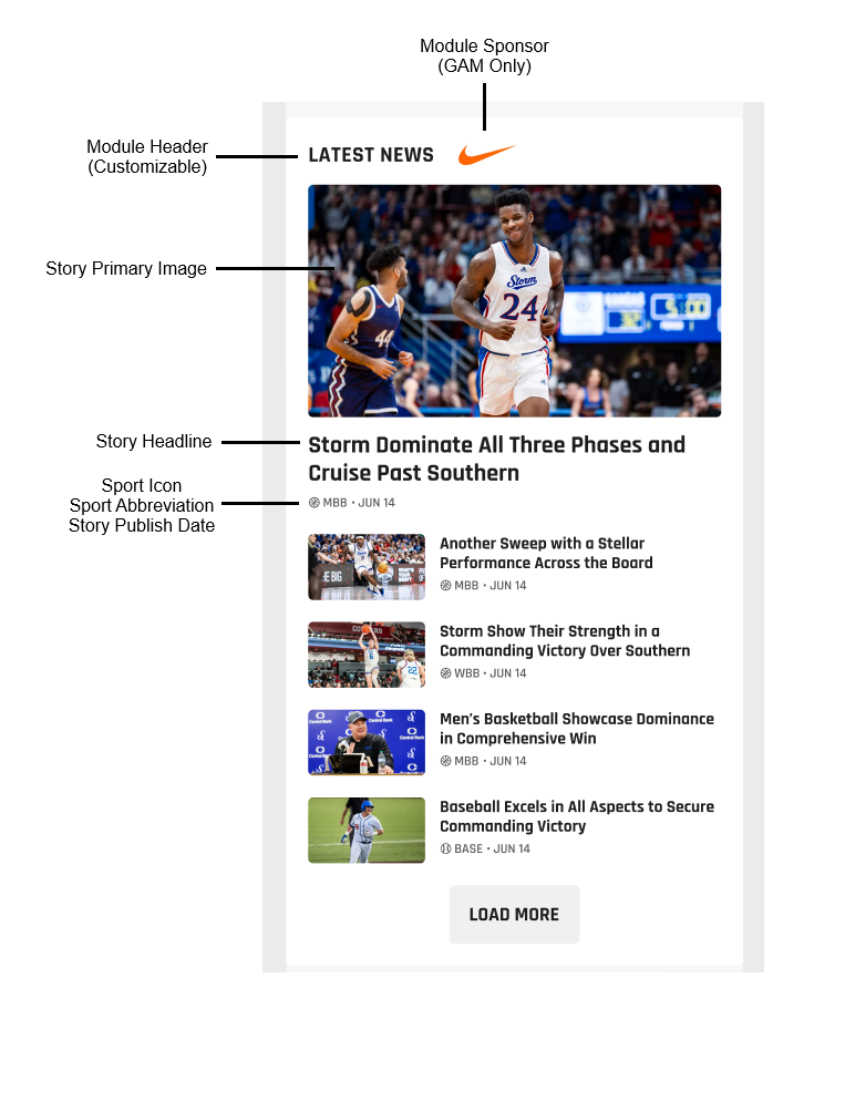
The Stories List module is a collection of the most recently published stories from the CMS (Stories > Add New Story).
On the Home Screen, recently published stories from all sports will show in the stories list module.
On Sport Home Screens, recently published stories from the respective sport will show in the stories list module.
How It Works
The latest five (5) stories that have been published will populate in this module.
- Story cards include the headline, primary image thumbnail, sport icon, sport abbreviation and publish date (month/day).
- The most recent story will appear as a “hero” (larger than the others). The next four are listed beneath it with smaller thumbnails of their primary story images and headlines.
- Tapping the story card will open the story in the app’s native story view.
Module Header
The title of this module is customizable. The default header is “Latest News”.
To change the title from “Latest News” to “Headlines” for example, go to: Mobile App Settings > Home Screen Configuration > Stories List > Click the “pencil” icon > Input the desired text (max. 25 characters) > Save.
Module Sponsor
The Stories List module is sponsorable via Google Ad Manager (GAM) only. Clients wishing to sponsor this module should contact Learfield AdOps(adops@learfield.com) to set up a campaign. This module is not sponsorable at the sport level. If this module is sponsored, that same sponsor image carries through to the Stories List module on all Sport Home Screens.
The sponsor image appears to the right of the module header.
- Size: 75x25
- Click-through: Yes
Load More & View Archives Buttons
- At the bottom of the module is a LOAD MORE button. Tapping this button causes the module to expand and populate the next five (5) most recently published stories below the previous five for a total of ten (10) stories.
- Once 10 stories have been populated, a VIEW ARCHIVES button renders at the bottom of the story list. Tapping this button launches an external, WebView of the client’s “News” archive for all sports. Dismissing or closing the WebView returns the user to the app.
- Example: cuse.com/archives
Video Slider
What It Is
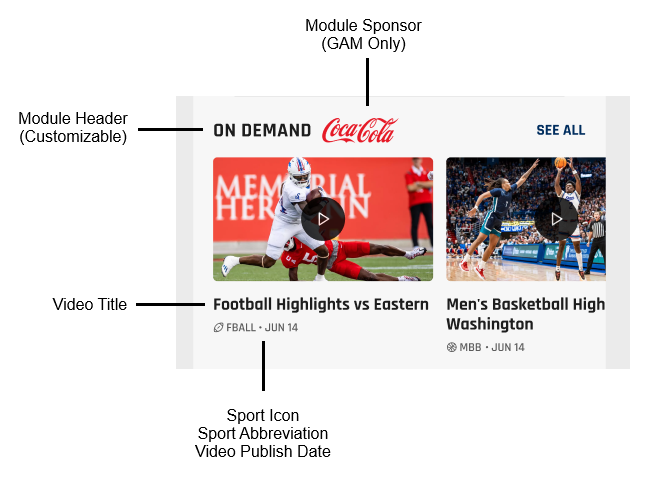
The Video Slider module is a collection of the most recently published videos in the CMS (Video > Media Files).
On the Home Screen, recently published videos from all sports will show in the video slider module.
On Sport Home Screens, recently published videos from the respective sport will show in the video slider module.
This module dynamically serves SIDEARM hosted Video Media Files only. YouTube videos and Audio Media Files are excluded. To consume YouTube or On Demand audio content, the user must navigate to the app’s native Media screen. The Media screen entry point is typically located on the bottom navigation bar or in the “More” menu.
How It Works
The latest six (6) Video Media Files that have been published populate in this module in a carousel/slider format.
- Videos cards include the title, primary image thumbnail (w/play button overlay), sport icon, sport abbreviation and publish date (month/day).
- Tapping the card opens the video in the app’s native media player.
Module Header
The title of this module is customizable. The default header is “Latest Videos”.
To change the title from “Latest Videos” to “On Demand” for example, go to: Mobile App Settings > Home Screen Configuration > Video Slider > Click the “pencil” icon > Input the desired text (max. 25 characters) > Save.
Module Sponsor
The Video Slider module is sponsorable via Google Ad Manager (GAM) only. Clients wishing to sponsor this module should contact Learfield AdOps to set up a campaign. This module is not sponsorable at the sport level. If this module is sponsored, that same sponsor image carries through to the Video Slider module on all Sport Home Screens.
The sponsor image appears to the right of the module header.
- Size: 75x25
- Click-through: Yes
See All
Opposite the module header is the text “SEE ALL.” Tapping this text navigates the user to the app’s native Media screen.
Videos are filtered by sport ID so only those associated to Football, for example, appear on the Football screen. Additionally, “SEE ALL” navigates the user to the native view of the Media screen filtered for that sport only.
Gallery Slider
What It Is
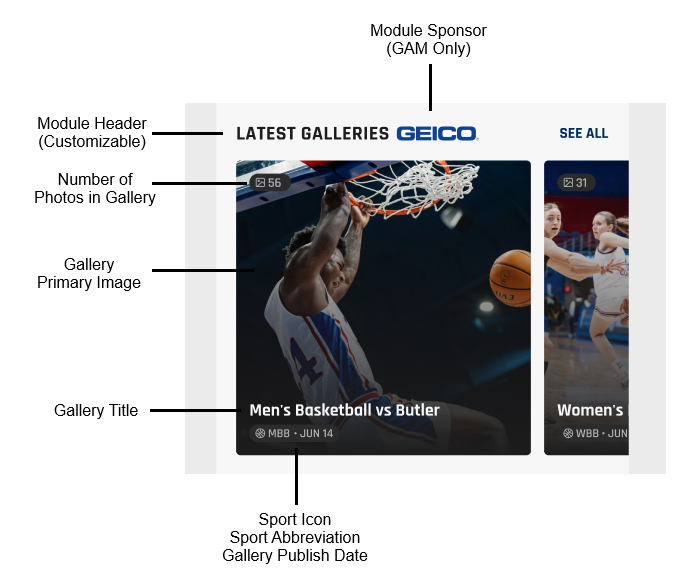
The Gallery Slider module is a collection of the most recently published photo galleries in the CMS (Media > Galleries).
On the Home Screen, recently published photo galleries from all sports will show in the gallery slider module.
On Sport Home Screens, recently published photo galleries from the respective sport will show in the gallery slider module.
How It Works
The latest six (6) photo galleries that have been published populate in this module in a carousel/slider format.
- Galleries include the title, primary image, sport icon, sport abbreviation and publish date (month/day).
- There is a pill label in the top left corner that lists the number of photos in the gallery.
- Tapping the gallery primary image opens the gallery in the app’s current native gallery view.
Module Header
The title of this module is customizable. The default header is “Latest Galleries”.
To change the title from “Latest Galleries” to “Photo Galleries” for example, go to: Mobile App Settings > Home Screen Configuration > Gallery Slider > Click the “pencil” icon > Input the desired text (max. 25 characters) > Save.
Module Sponsor
The Gallery Slider module is sponsorable via Google Ad Manager (GAM) only. Clients wishing to sponsor this module should contact Learfield AdOps to set up a campaign. This module is not sponsorable at the sport level. If this module is sponsored, that same sponsor image carries through to the Gallery Slider module on all Sport Home Screens.
The sponsor image appears to the right of the module header.
- Size: 75x25
- Click-through: Yes
See All
Opposite the module title is the text “SEE ALL.” Tapping this text opens a WebView of the client’s main OAS gallery page. Dismissing or closing the WebView returns the user to the app.
- Example: cuse.com/galleries
Promo Slider
What It Is
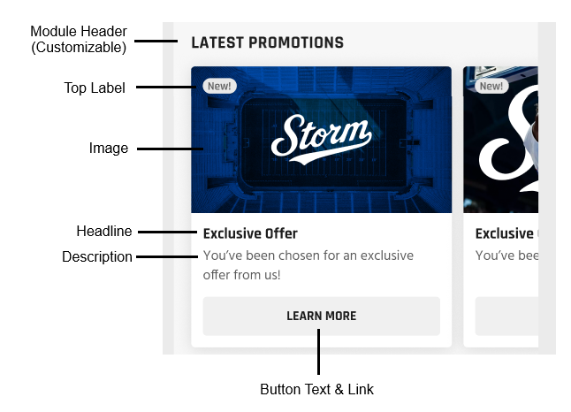
The Promo Slider module is a high-visibility area designed to feature fan engagement content. Examples include season ticket packages, gameday themes like a “White Out” or “Military Appreciation Day,” and exclusive fan experiences.
The module displays on the Home Screen Only.
How It Works
The Promo Slider is a configurable module, meaning a user must populate content in order for this module to display on the Home Screen.
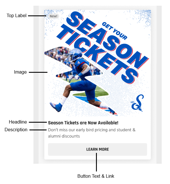
- Promo cards include a promotion title, image, description text and call-to-action button (optional).
- There is a pill label in the top left corner for text that can be utilized for more context or to add details to the promotion.
- Examples: “New!” or “For a Limited Time!”
- Tapping the promo card opens the button link URL from the CMS in a WebView.
Configure
To set up this module, go in the CMS to: Mobile App Settings > Home Screen Configuration > Promo Slider.
There they are presented with three options:
- Edit (“pencil” icon)
- Hide (eye icon)
- Delete (“trash can” icon)

Edit
To edit this module, click the “pencil” which opens the following modal:
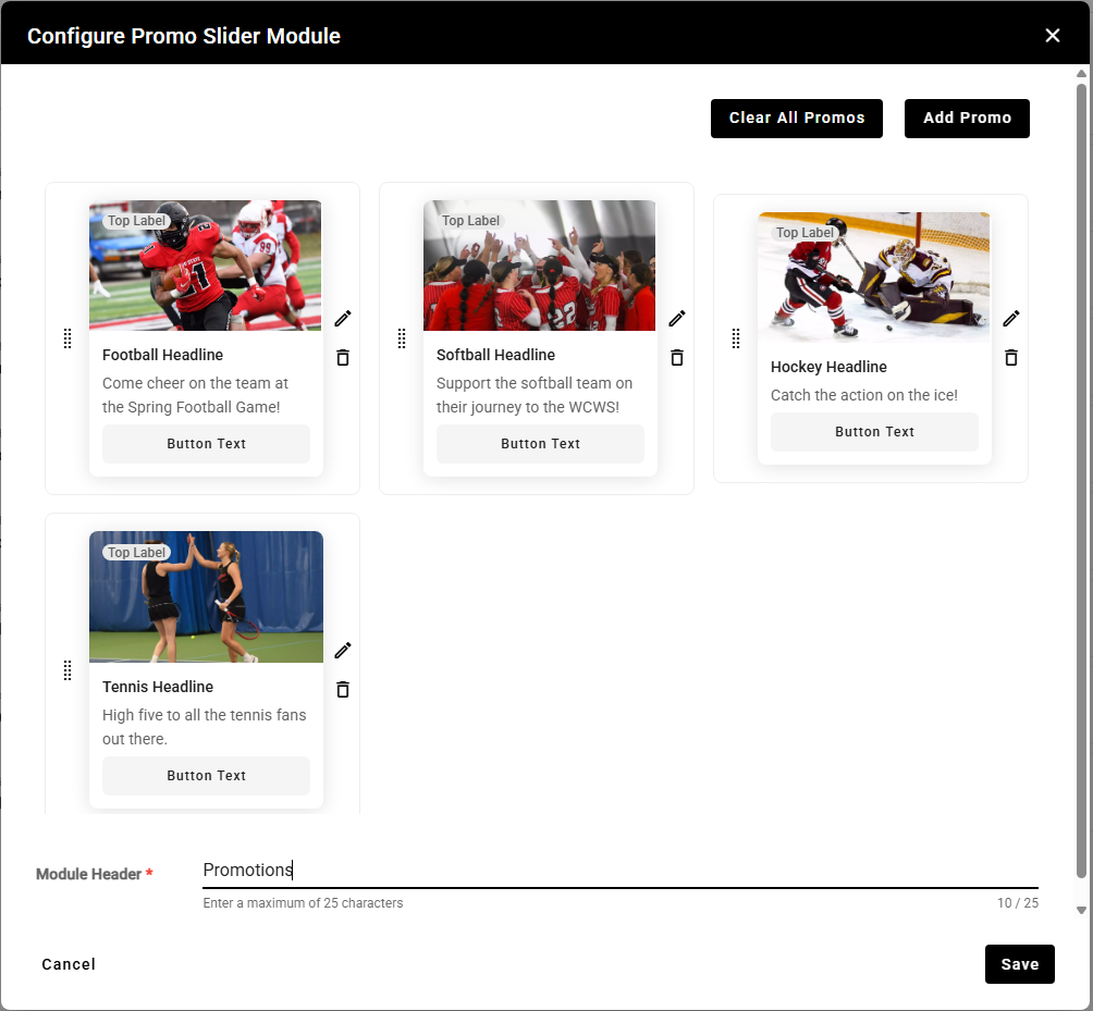
- Add Promo - Tapping this button allows you to add a promotional item to the slider.
- Clear All Promos - Removes all promotions from the module.
There are three actions (Move/Reorder, Edit and Delete) that can be taken for each promotion. They are represented by “dot grid”, “pencil”, and “trash can” icons.
- Clicking the “dot grid” and dragging the module allows you to reorder the promotions.
- Clicking the “pencil” allows you to edit the details of an existing promotion.
- Clicking the “trash can” removes the promotion from the module.
Module Header
The title of this module is customizable. Input the desired title in this field (Example: “Orange Offers”).
The limit for the title is 25 characters.
Hide
Closing the  icon will hide this module from the app home screen layout. The previous configuration settings are retained.
Delete
Tapping the “trash can” deletes the module from the app home screen layout completely.
Add a Promo
To add a promo to the module, click the ADD PROMO button and input the promo details into the below modal:
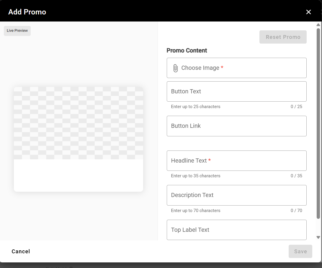
- Choose Image - Attach the image you want to use for this promo (required field).
- Button Text - To render a CTA button at the bottom of the promo card, input text here (max. 25 characters).
- Button Link - URL the user is directed to when the promo card is tapped goes here.
- Headline Text - Title of the promo (max. 35 characters) [required field].
- Description Text - More detailed explanation of the promo (max. 70 characters).
- Top Label Text - If text is input in this field it displays in a pill in the top left corner of the promo card.
TIPS:
- Use the Live Preview function to see exactly how the promo will look in the app.
- Recommended image ratio is 16:9.
- Shorter text is best, so be concise!
Hero Promo
What It Is
The Hero Promo is a high-visibility space designed to feature your most important engagement content. Examples include season ticket packages, gameday themes like a “White Out” or “Military Appreciation Day,” and exclusive fan experiences.
The module displays on the Home Screen only.
How It Works
The Hero Promo is a configurable module, meaning you must populate content in order for this module to display on the Home Screen.
- The module includes the promotion title, image, description text and call-to-action button (optional).
- There is a pill label in the top left corner for text that can be utilized for more context or to add details to the promotion.
- Examples: “New!” or “For a Limited Time!”
- Tapping the card opens the button link URL from the CMS in a WebView.
Configure
To set up this module, go to: Mobile App Settings > Home Screen Configuration > Hero Promo.
There admins are presented with three options:
- Edit (“pencil” icon)
- Hide (
 icon)
icon) - Delete (“trash can” icon)

Edit
To edit this module, click the “pencil” which opens the following modal:
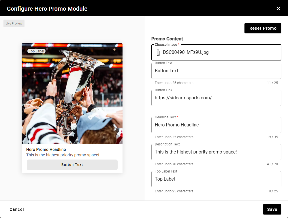
- Choose Image - Attach the image you want to use (required field).
- Button Text - To render a CTA button at the bottom of the card, input text here (max. 25 characters).
- Button Link - URL the user is directed to when the card is tapped goes here.
- Headline Text - Title of the Hero Promo (max. 35 characters) [required field].
- Description Text - More detailed explanation of the Hero Promo (max. 70 characters).
- Top Label Text - If text is input in this field, it displays in a pill in the top left corner of the Hero Promo card.
- Reset Promo - Clears existing promo information.
TIPS:
- Use the Live Preview function to see exactly how the promo will look in the app.
- Recommended image ratio is 1:1 (square).
- Shorter text is best, so be concise!
Hide
Closing the  icon will hide this module from the app home screen layout. The previous configuration settings are retained.
Delete
Tapping the “trash can” deletes the module from the app home screen layout completely.
Shop
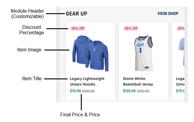
What It Is
The Shop module is a collection of items to feature from your team store.
This module appears on the Home Screen only.
If a new Product is added during this process, it will also appear on your website, if you had a Shop module on your site.
How It Works
Shop is a configurable module, meaning you must populate content in order for this module to display on the Home Screen.
The items listed are based on what has been added to their shop experience in the CMS (Other > Shop).
Shop cards include the product title, image, pricing and a discount (if offered).
Configure
To set up this module, go to: Mobile App Settings > Home Screen Configuration > Shop.
There admins are presented with three options:
- Edit (“pencil” icon)
- Hide (
 icon)
icon) - Delete (“trash can” icon)

Edit
To edit this module in the CMS, click the “pencil” which opens the following modal:
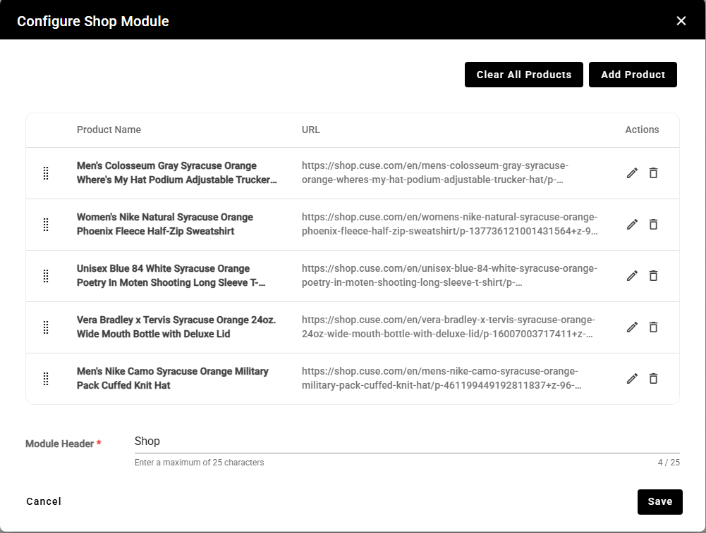
- Add Product - Tapping this button allows you to add an item to the slider from the existing product dropdown menu.
- Clear All Products - Removes all products from the module.
- Module Header - The title of this module is customizable. Input the desired title in this field (Example: Gear Up). The limit for the title is 25 characters.
There are three actions (Move/Reorder, Edit and Delete) that can be taken for each item in the product list. They are represented by “dot grid”, “pencil”, and “trash can” icons.
- Clicking the “dot grid” and dragging the module allows you to reorder the product list.
- Clicking the “pencil” allows you to edit the overall item information originally entered when the product was created in the CMS (Other > Shop).
- Clicking the “trash can” removes the item from this module’s product list.
Hide
Closing the  icon will hide this module from the app home screen layout. The previous configuration settings are retained.
Delete
Tapping the “trash can” deletes the module from the app home screen layout completely.
View Shop
- Opposite the module title is the text “SEE ALL.” Tapping this text opens the team store URL in a WebView. Dismissing or closing the WebView returns the user to the app.
- Example: shop.cuse.com
Was this article helpful?
That’s Great!
Thank you for your feedback
Sorry! We couldn't be helpful
Thank you for your feedback
Feedback sent
We appreciate your effort and will try to fix the article