Splash pages are a great tool for bringing specific things to fans' attention, but let's make sure they're accessible.
Images for Splash Pages
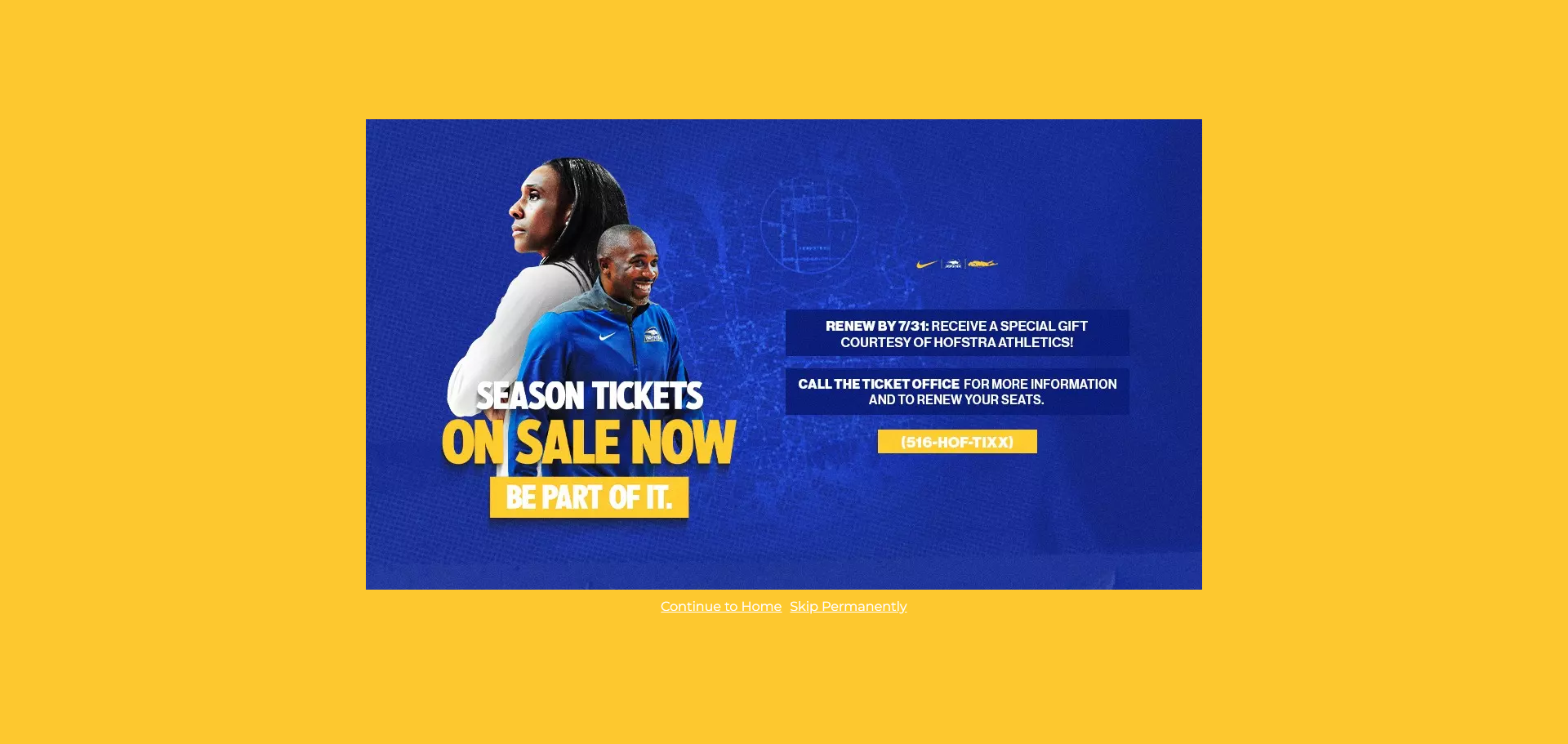
An image that contains text should include that text in the alternative text (alt text) for several important reasons:
Accessibility for Screen Readers
People who use screen readers rely on alt text to understand the content of images. If an image contains important text—such as game info or ticket information—and that text isn’t included in the alt text, users with visual impairments will miss out on that information entirely.Preserving Meaning and Context
If the text in the image conveys essential information (e.g., a chart label, a product name, or event details), including it in the alt text ensures that the image’s full meaning is preserved, even if the image can’t be seen.Fallback for Broken Images
If an image fails to load, the alt text is displayed in its place. Including the image’s text ensures that users still get the key message even if the image doesn’t appear.
In the example above, the image's alt text should be "Season tickets on sale now. Renew by 7/31 to receive a special gift. Call the ticket office for more info [phone number]." Not all of the information is vital so I didn't include those bits.
For more information on Image Accessibility, visit the Image Accessibility section of the Knowledge Base.
Color Contrast
It’s important to make sure that the content on the splash page is legible for color blind fans. In the example above, the background color is yellow and the link text under the image is white. SIDEARM recommends using WebAIM’s color contrast checker and we’ve created documentation on how to check colors using the site.
We also recommend making sure the text in the image passes color contrast requirements.
Was this article helpful?
That’s Great!
Thank you for your feedback
Sorry! We couldn't be helpful
Thank you for your feedback
Feedback sent
We appreciate your effort and will try to fix the article